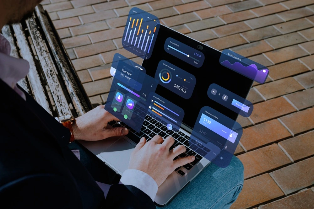
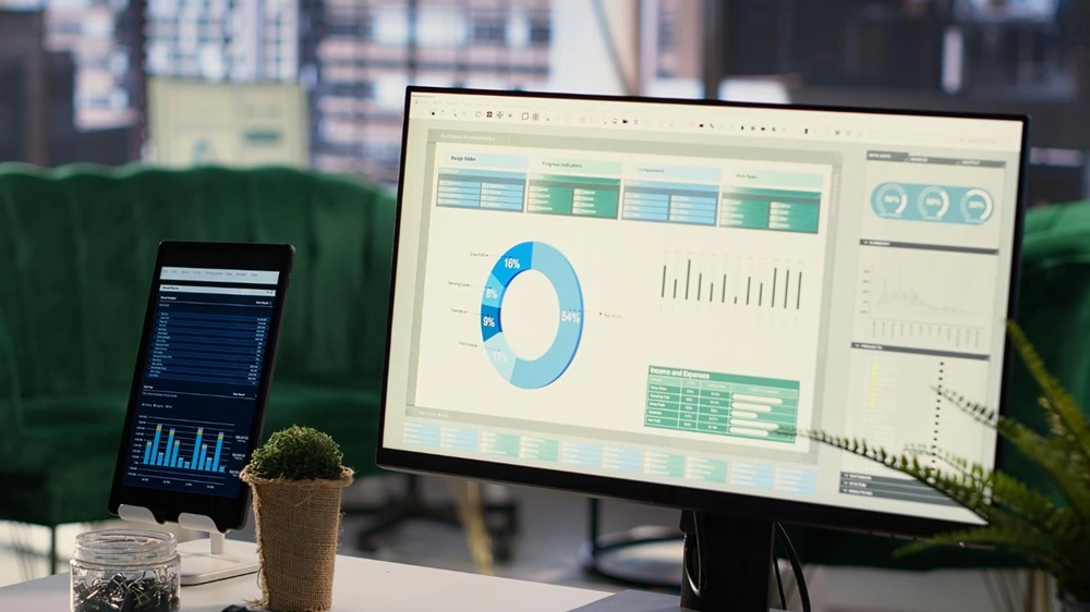
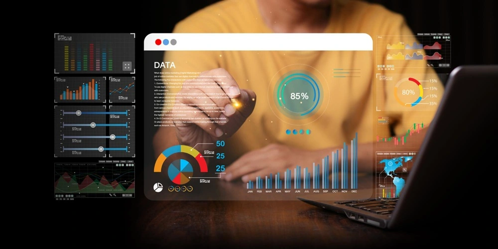
HR data visualisation transforms raw human resources metrics into intuitive charts, graphs, and dashboards. By converting complex information—such as headcount fluctuations, turnover rates, and performance indicators—into visual formats, HR teams gain clarity on workforce trends and make data-driven decisions with confidence.
Interactive dashboards consolidate multiple data sources—payroll, talent management, engagement surveys—into a single view. Stakeholders can then identify issues, anticipate workforce changes, and align HR strategy with corporate objectives in real time. Visualising leave patterns and workforce demographics enhances both operational efficiency and strategic planning.
This ultimate guide covers:
- Leading HR data visualisation tools and integrations
- Common chart types and chart selection best practices
- Design principles for clear, compelling dashboards
- Real-time vs. static HR dashboards and use cases
- Data privacy, ethics, and compliance considerations
- Examples of HR dashboard templates
- Integration with MiHCM’s Analytics and Data & AI modules for predictive insights
Key takeaways
- HR data visualisation converts complex workforce metrics into clear, actionable visuals.
- Choosing the right chart type and tool is critical for clarity and impact.
- Real-time dashboards enable proactive workforce management and faster response.
- Ethical practices and data privacy ensure compliance and trust.
- MiHCM integrates analytics modules to power dynamic HR dashboards.
What is HR data visualisation and why does it matter?

HR data visualisation comprises two main approaches: exploratory and explanatory.
Exploratory visualisations help analysts uncover patterns and anomalies without predefined hypotheses, ideal for talent gap analysis or absenteeism trends. Explanatory visualisations, on the other hand, communicate specific findings to stakeholders, such as presenting turnover drivers to executives.
Visual storytelling enhances comprehension by combining narrative and visuals. For example, a narrative around rising attrition paired with a trend line chart highlights seasonality and triggers deeper discussion. According to a Bain & Company brief, organisations leveraging advanced analytics were five times more likely to make faster decisions than peers (Bain & Company, 2025).
Integrating predictive analytics—such as MiHCM’s Data & AI module—elevates visualisations from descriptive to predictive. Turnover forecasting models combined with dynamic dashboards enable HR teams to anticipate resignations, plan talent pipelines, and align retention strategies with business goals.
Popular tools for HR data visualisation
Leading platforms for HR data visualisation include:
- MiHCM Analytics: Embedded within MiHCM suite. Provides self-service reporting and interactive drilldowns.
- Power BI: Seamless integration with Microsoft 365 and Excel. Offers interactive dashboards and real-time data refresh.
- Tableau: Highly customisable visuals and extensive community support. Scales for enterprise deployments.
- Visier: Purpose-built for HR analytics with pre-built dashboards for turnover, diversity, and talent planning.
Comparison:
- Integration: MiHCM Analytics and Data & AI modules offer seamless data flow from HRIS and payroll, while standalone BI tools may require connectors.
- Customisation: Tableau leads in visual flexibility; Power BI balances ease-of-use and customisation; MiHCM provides HR-specific templates.
- Scalability: Enterprise-grade governance in Tableau and Power BI; MiHCM scales with existing HR infrastructure.
Common types of HR data visualisations

- Bar Charts: Track headcount and turnover trends by department or location. Ideal for comparing discrete categories.
- Line Graphs: Illustrate absenteeism or performance metrics over time. Reveal seasonality and long-term trends.
- Heatmaps: Visualise employee engagement scores or diversity ratios across teams. Quickly flag areas needing attention.
- Funnel Charts: Analyse recruitment pipelines from application to hire. Highlight bottlenecks and conversion rates.
- Quadrant & Scatter Plots: Segment performance vs. potential for talent calibration and succession planning.
Each visualisation type serves a distinct purpose. For example, funnel charts make recruitment insights actionable by showing conversion metrics, while heatmaps excel at highlighting high- and low-engagement groups in a single view.
Design principles for effective HR dashboards
- Maintain Clarity: Use consistent colour schemes and remove non-essential elements to focus attention on key metrics.
- Audience Alignment: Tailor dashboards to roles—executives need high-level KPIs, analysts require granular drilldowns, managers benefit from operational views.
- Clear Labels & Tooltips: Ensure every chart includes labels, legends, and tooltips for context. Avoid jargon when possible.
- Responsive Layouts: Design for both desktop and mobile. Prioritise critical metrics at the top for quick insights on smaller screens.
Real-time vs. static HR dashboards

Static Dashboards are refreshed periodically—daily, weekly, or monthly—and focus on historical reporting and compliance. They’re well-suited for end-of-month summaries, audit trails, and archival purposes.
Real-Time Dashboards ingest live data feeds, offering immediate alerts and up-to-the-minute metrics. Use cases include:
- Proactive absenteeism monitoring with instant notifications.
- Live headcount tracking to support M&A or rapid growth initiatives.
- Real-time diversity metrics to drive inclusion programs.
Benefits of real-time insights include faster response to turnover spikes, rapid identification of engagement drops, and data-driven agility for HR operations.
Data privacy and ethics in HR visualisation
- Regulatory Compliance: Adhere to GDPR, CCPA, and local labour laws. Restrict personal identifiers and implement purpose-limited data use.
- Anonymisation Techniques: Aggregate data into cohorts or apply data masking to protect individual privacy when displaying sensitive metrics.
- Bias Mitigation: Review visualisations for unintended bias—ensure diversity dashboards don’t reinforce stereotypes and adjust scales to prevent misinterpretation.
- Audit Trails & Access Controls: Use MiHCM’s built-in audit logs and role-based permissions to track dashboard usage and ensure only authorised users view sensitive data.
Inspiring HR dashboard examples
- Turnover Analysis Dashboard: Color-coded alerts highlight departments exceeding retention thresholds. Bar charts compare monthly turnover rates.
- Engagement Heatmap: Visualises pulse survey results across teams. High- and low-engagement areas are immediately visible for targeted action.
- Recruitment Funnel: Displays applicant-to-hire ratios and time-to-fill metrics. Interactive filters allow slicing by source or job family.
- Diversity & Inclusion Dashboard: Segments workforce by gender, ethnicity, and age group. Line graphs track diversity improvements over time.
Essential HR dashboard metrics

- Turnover Rate: Percentage of employees who leave over a period. Track retention risk factors by department.
- Time-to-Hire: Average days from application to hire. Monitor applicant-to-hire ratios to optimise recruitment.
- Absenteeism Trends: Track unplanned leave patterns. Assess leave utilisation rates and identify spikes.
- Performance Distribution: Visualise competency scores across teams. Spot high-potential employees for succession planning.
- Workforce Demographics: Diversity ratios and age distribution. Ensure compliance and track inclusion initiatives.
Choosing the right visualisation for your HR data
Select chart types based on the data story:
- Trends: Use line graphs to display changes over time, such as headcount growth or attrition.
- Distributions: Bar charts or histograms work well for categorical metrics like performance ratings or department sizes.
- Correlations: Scatter plots reveal relationships, for example, between training hours and performance outcomes.
- Comparisons: Dual-axis charts can compare related metrics, such as turnover rate vs. engagement score.
Advanced features in MiHCM Analytics and Data & AI modules support:
- Interactive Drilldowns: Quickly explore detailed HR metrics without switching tools.
- Custom Chart Templates: Maintain consistency and compliance across visual reports.
Validate readability by user testing with HR stakeholders. Confirm that chosen visualisations answer critical business questions in a single glance.
Integrating MiHCM with HR data visualisation
- Seamless Data Flow: Connect payroll and HR modules directly into dashboards for up-to-date metrics.
- Pre-Built Templates: Use Excel and Power BI connectors with MiHCM’s ready-made HR dashboard templates.
- Predictive Insights: Leverage MiHCM Data & AI for turnover forecasting and absenteeism alerts.
- Automated Reporting: Schedule dashboard refreshes and stakeholder notifications to keep teams aligned.
Next steps

HR data visualisation empowers teams to transform complex workforce data into actionable insights. By leveraging the right tools, chart types, and design principles, organisations can drive proactive decision-making and stakeholder alignment.
- Experiment with different visualisation tools.
- Incorporate real-time dashboards to monitor critical metrics continuously.
- Adopt privacy and ethics best practices to maintain compliance and trust.
For further reading, explore our HR dashboard examples and metrics guides, and begin building dynamic HR dashboards that drive measurable business outcomes.


